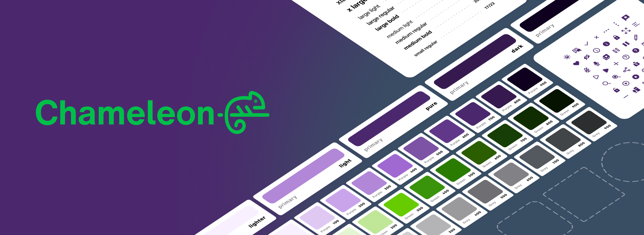
Chameleon Design System
Is a white-label and multi-platform design system that serves the SmartHome+ app product teams.
My role: I partnered with TELUS in an embedded role to lead the product vision, design and execution of a multi-platform and adaptable design system that supports 4+ teams of designers and developers working on the SmartHome+ app.
The initial scope and focus of the design system covers Native iOS / Android, with plans to expand into tvOS and responsive web in the near future.
Role
Design System Manager
Team
1-2 Designers, 4+ Developers
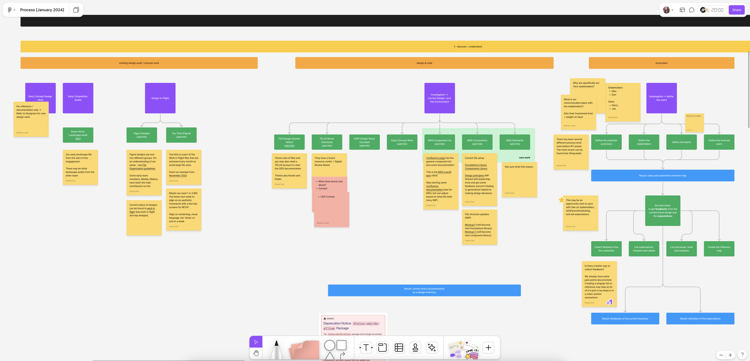
Discovery
+ interviews 🗣️
We interviewed designers, developers, product owners, previous design systems leads, and stakeholders to understand how the current system was integrated into product processes, assess pain points and gain an understanding in what they wanted from a design system.
Audits were also conducted to assess design files, components and code libraries.
Lack of clarity and confusion across teams
We noted confusion around the source of truth for components due to multiple libraries connections, siloed design decisions, undocumented variations, and components in final designs spread across multiple Figma files.
Lack of mutual understand around what the system was meant to be
During interviews we discovered the design system was built rapidly without direction, purpose and alignment with existing design systems at TELUS.
Static design decisions and hardcoded solutions
Designs were implemented as hardcoded components without the design token structure needed to establish strong foundations for theming.
Considerable drift between design intent and implementation
We uncovered noticeable inconsistencies in what is in final source of truth designed screens vs had been added to code libraries.
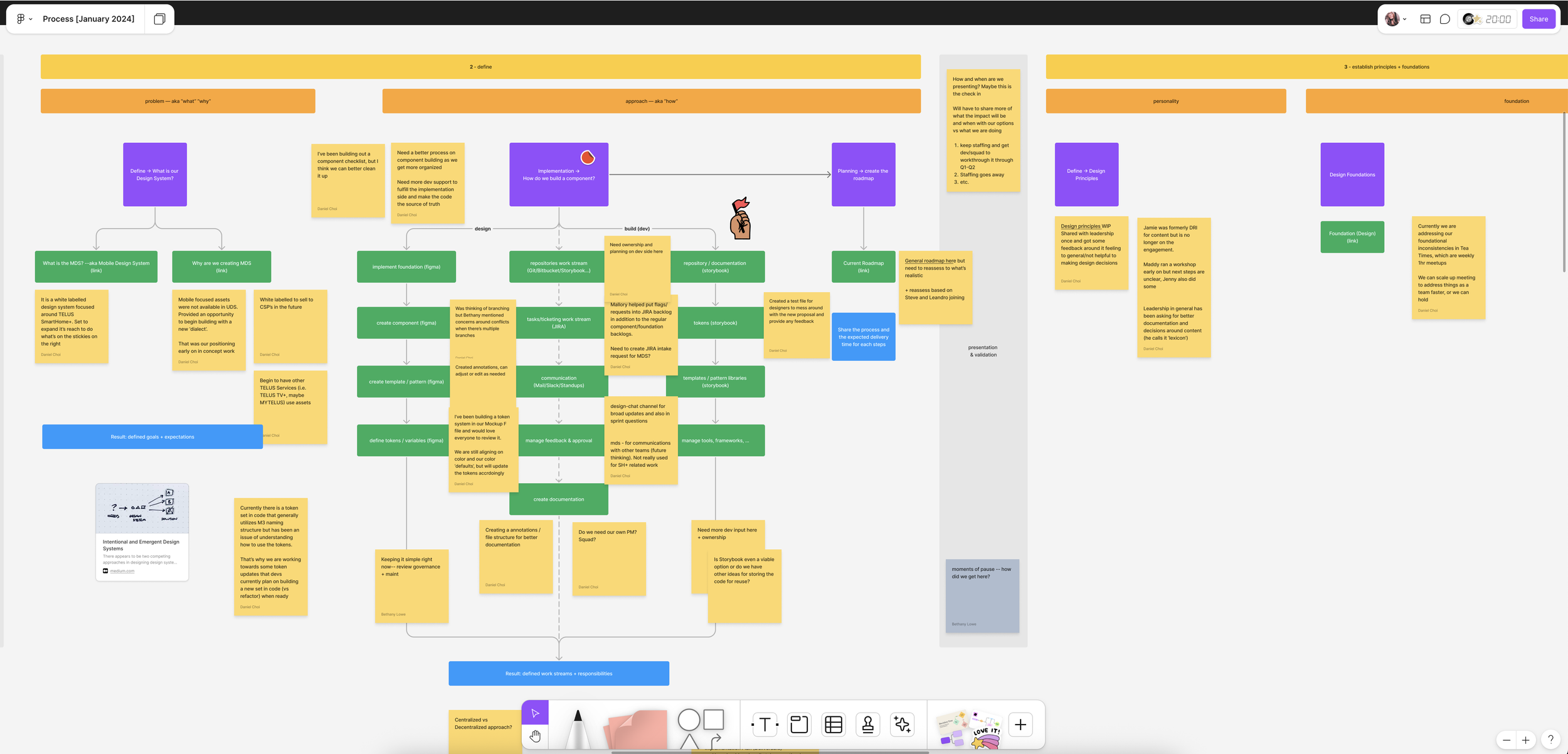

Plan
After we conducted interviews and workshops, we collectively agreed establishing new design system made the most sense for the product teams. SH+ product teams needed a system that could support multiple brands and scale across platforms
Key areas:
Design token structure established with alignment in utilization for design and development
Consolidation of pre-existing libraries (foundations and components)
Implementation of primitive, theme, and semantic design tokens
Clear design system architecture mapping
Migration of new design system across existing designed source of truth screens
Documentation best practices established to enable adoption, governance and contribution
Intentional execution
We needed to create the necessary building blocks for our teams to run. In order to do that, we first intentionally focused dialing in our foundations. It was difficult to balance the pressure from stakeholders who wanted components right away and work to convince them that this is the best first step. Especially given that we did have a previous library of components that was used to launch the MVP of the product.
We wanted to make sure we captured design decisions and had a system in place that could translate our design decisions at scale. In this case, our foundations not only included styles and our primitive values, but also the systems needed to support our goals.
Design tokens were the first major effort we dove into and focused on establishing.
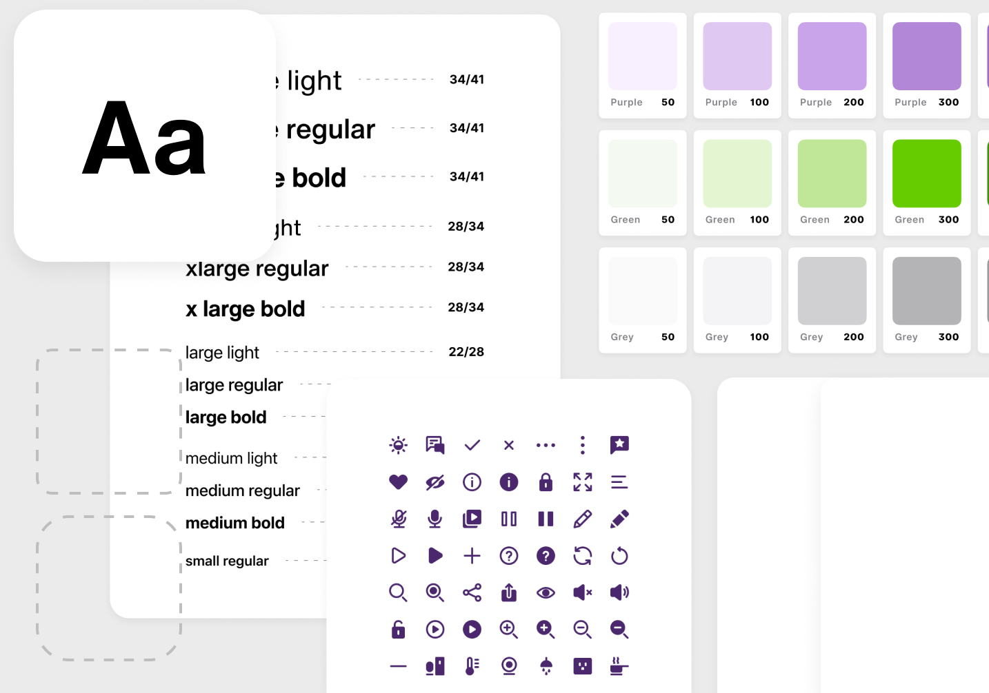
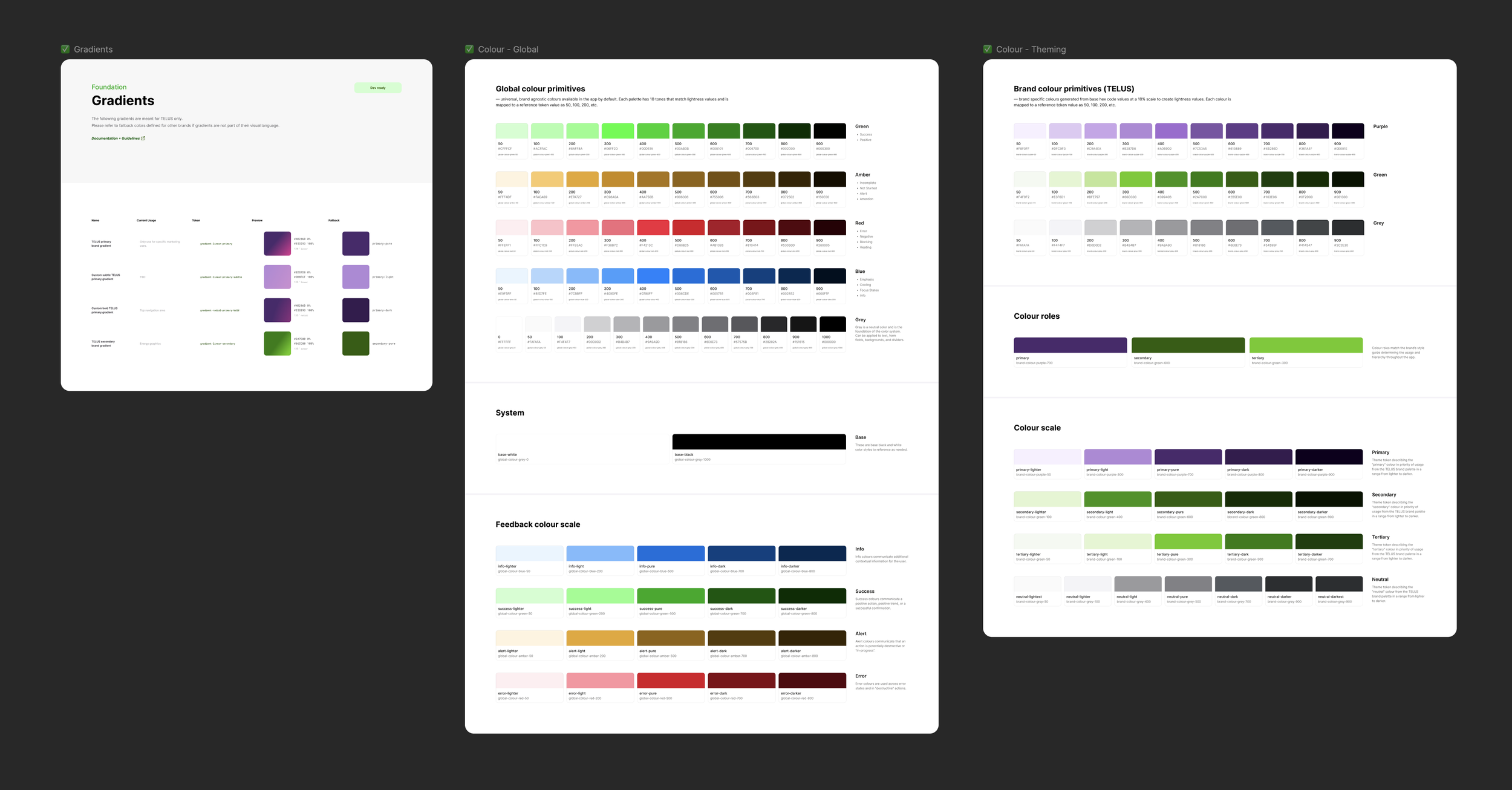
Design tokens
Design tokens are what make brand theming and dark mode possible at scale within our design system and product.
In this example, we take TELUS’s primary brand color then apply it seamlessly across the app.

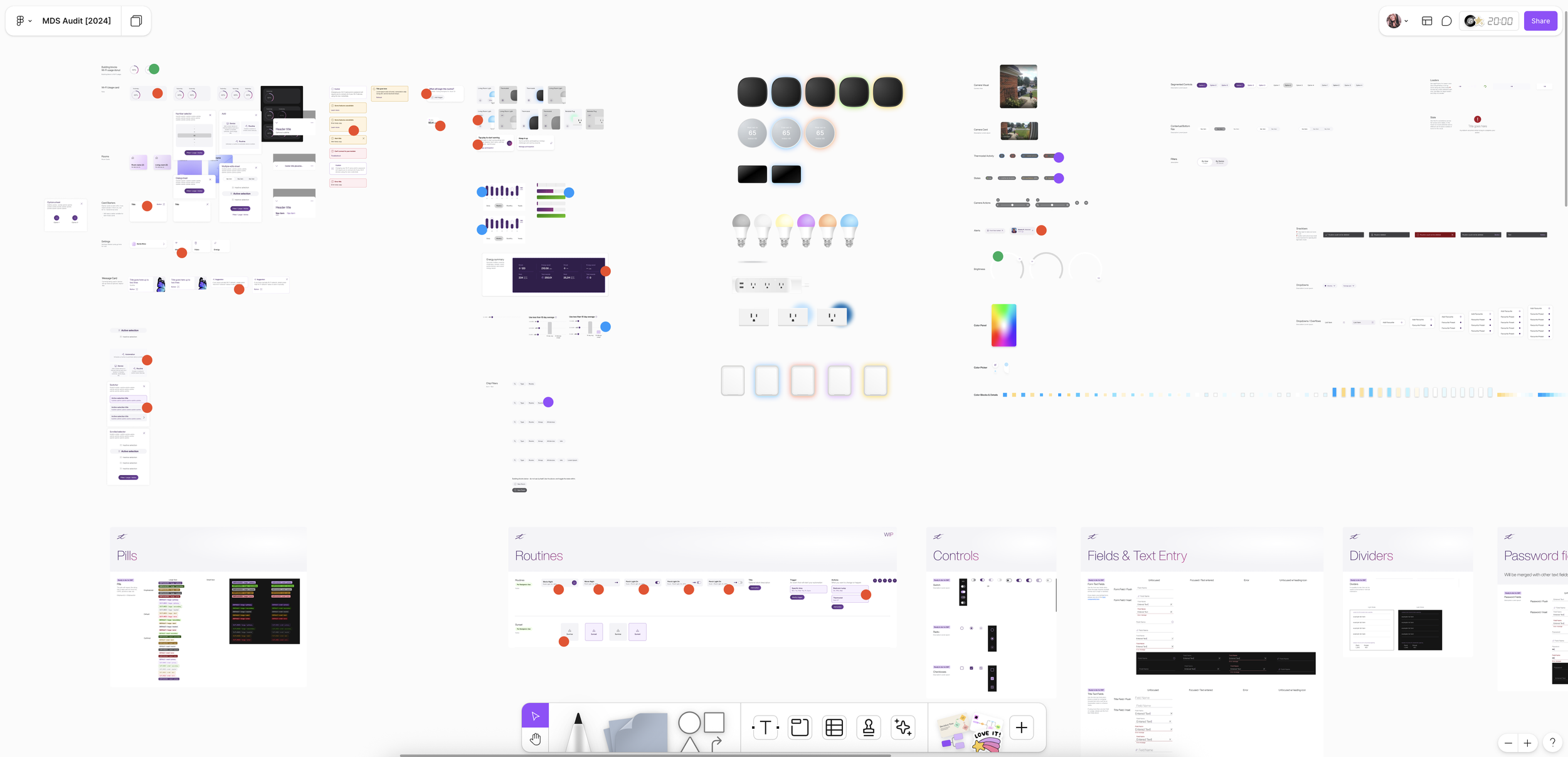
Foundations
The core of our design system not only includes color, typography, icons, border radii, elevation, and space within our Figma libraries as design tokens, but also our code libraries and the systems that support them.
Future: Motion
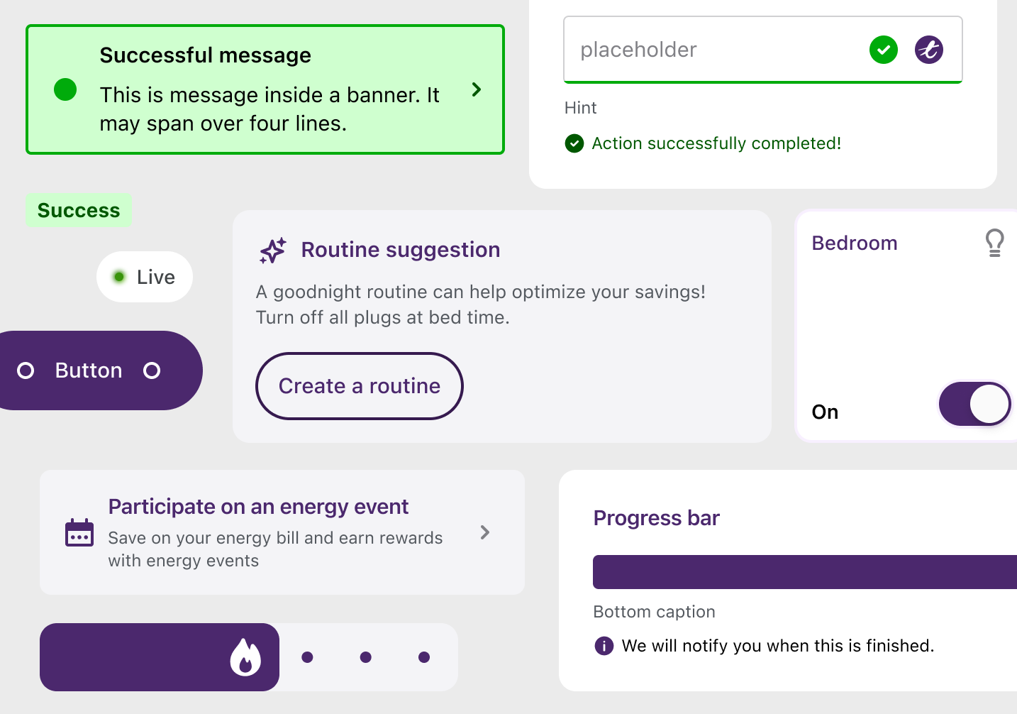
Native components
Named reusable elements in our design that can be used in across platforms while retaining design vision and intention.
Documentation, governance + adoption
Work dedicated to documenting components, technical details, processes, design tokens, governance and contribution.

Theme “white label”
Brand expression was a very critical ask, requiring original system (MDS) to be redesigned.
On the surface, “white label” just means reskinning the app’s colors and typography to match a brand’s look and feel, however, we plan to expand on this to include content and patterns in the future.

Outcomes 🎉
Foundations established with support for brand theming and over 150+ languages
Improved design consistency gained across 4+ teams operating in parallel on features
Launched a comprehensive icon library with keyword search support in Figma and in code
Platform agnostic design token strategy, structure and implementation as Figma variables with translation for native platforms
Successful migration from previous design system foundations to design tokens without compromising or disrupting scheduled SH+ product releases
Component kick off in design and implementation with documentation, usage and governance
Contribution strategies drafted encouraging teams to actively participate in the design system