How we utilized data to inform a navigation pattern redesign
Gathering and analyzing data
The first step in my design process was identifying the major user groups: Who is using our site? How are they currently using our site? What can we do to improve their experience?
I was able to identify key audiences through analyzing analytics and research. I scheduled regular interviews with stakeholders in various departments and conducted surveys with students. The research conducted by SimpsonScarborough provided great insight and direction.
The primary audience being our prospective students (traditional, non-traditional, grad/doctoral) and traditional prospective student parents. We have subsets as well within those major categories such as, athletes (traditional), international, employees (non-traditional), returning students and transferring students
The secondary audiences include our current traditional, non-traditional, and international students, alumni, faculty, and staff.
The last group includes high school guidance counselors, community, etc…
Stakeholders are also an audience I am mindful of, this includes the President, Board of Trustees, Vice Presidents, and various department leads.
Once the various audiences are identified, next steps in my process included analyzing analytics, heat maps and surveys. I investigated how the users were using our sites based on behavior flows, traffic, and heat maps. Information from my research guided my early drafts for the top level and interior department page navigation schemes.
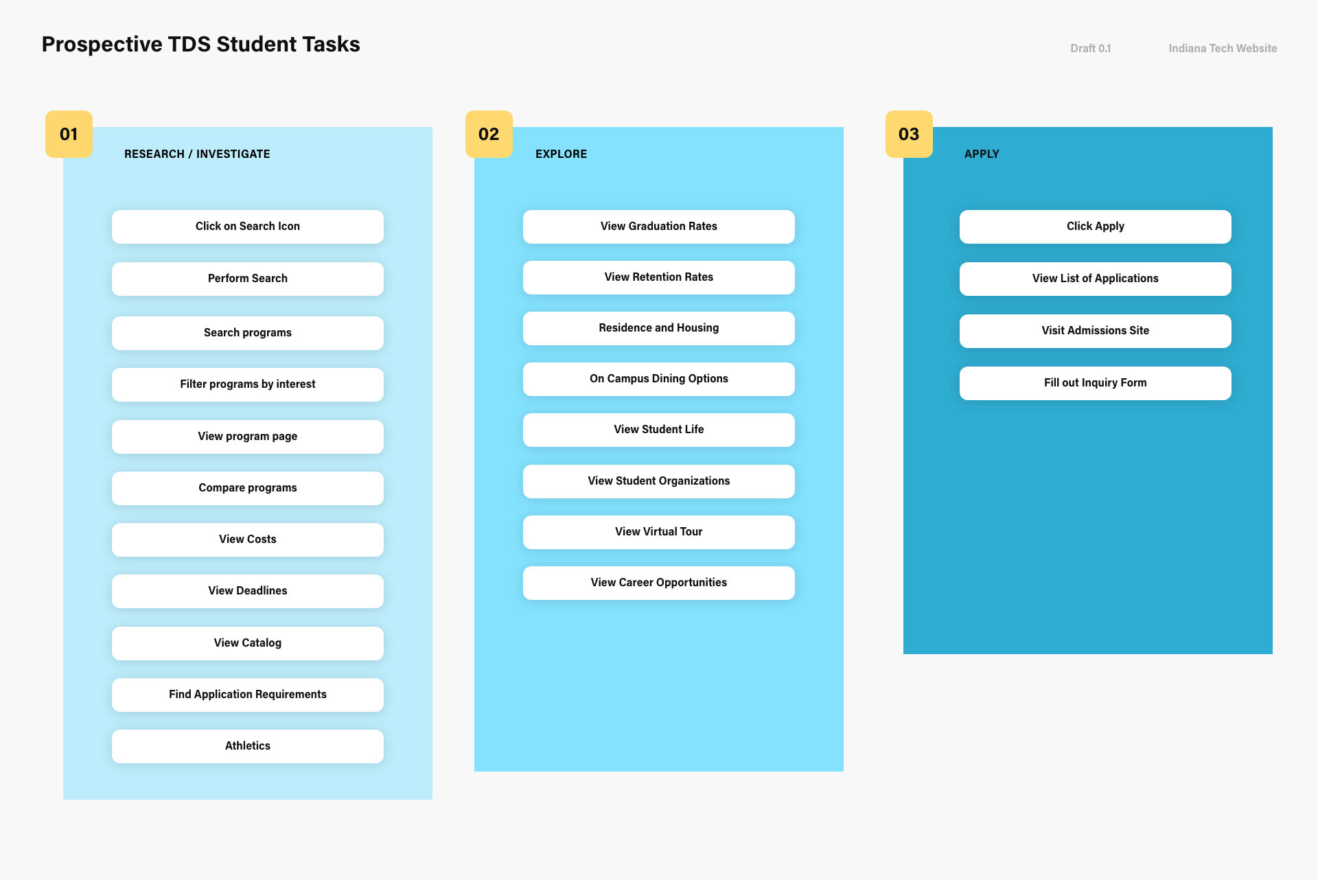

I utilized card sorting exercises to help with identifying priority and organization “aka buckets” for the navigation. That information became the first draft of the sitemaps for the main and interior department navigation schemes. In this, I also discovered a need for some sort of quick link area that evolved into a dashboard.
Market Research
Understanding the market
Identifying competitors
Performing competitive analysis
Thinking about possible layouts and options.
Experimentation

We partnered with SimpsonScarborough to aid in our rebranding efforts. With their help we were able to gain insight into our brand and what it means to our audiences.
Competitors are a mix of both a market based on specific education delivery models and local universities. When organizing the list I kept in mind how prospective students would compare universities and the various needs of our different types of students. Indiana Tech’s online delivery model, The College of Professional Studies, or known as “CPS” for non-traditional students was what made Indiana Tech special among its competitors.
During my research, schools with very similar delivery methods of education included Arizona State University (ASU) and Indiana Wesleyan University are ones we focused on. Arizona State University is an indirect competitor, while Indiana Wesleyan, Indiana Purdue Fort Wayne and University of Saint Francis are direct competitors.

Competitive Analysis worksheet for feature consideration.
In my research, I found that many of our direct competitors did not make use of video often for their homepages. Many of our direct competitors used slideshows. Chat was rarely implemented as an option, student perspectives/stories were not always featured and dates/calendars were not common. Not included but noted, program specific searches were often more of directory instead of an interactive experience.
Primary Navigation Analysis
Similar to the competitive analysis above, I also ran one for navigation items. The chart below indicates common patterns and terminology with other universities. It’s important to review these to make sure we’re not missing the mark with what our users are expecting to find/or are used to finding.
I’ve noticed that in attempts to stand out and brand services we offer students, if we go too far from expectations, it only causes confusion. Below we can see some patterns in terms of what is considered higher level and should be featured in a primary navigation.

Top level navigation analysis.
I followed up with tree testing, card sorting exercises with small focus groups and preference testing. Below is the organization we ended up with. After some continued testing, we made changes to naming and hierarchy.

Top level/global navigation early sitemap draft.
Our site also did not feature any sort of drop down with the navigation. The information was hidden exclusively on the individual landing pages. Users were forced to commit to a page without knowing what would be on that page. We affectionately referred to these pages as “link dumps” because they would often cram as many links as possible in each section.
I found in user testing, this only overwhelmed our uses and caused confusion. The interaction cost was too great to hide all of the information on landing pages.
I was able to organize links through the activity data presented in our heat maps. The data influenced the various hierarchies on the department pages later on, helped create “actionable” information and helped inform the links we included in the navigation and dashboards.

Example of our Academics heatmap from 2016. I used the hotspots over time to help determine a hierarchy for what users were actually going out of their way to click on. The heatmap data combined with feedback influenced what I included in the dashboard designs later on.
Content Inventory and Audits
Determining our priorities with the navigation also helped when approaching the content on the site. Auditing and reviewing the content is an ongoing process with yearly scheduled reviews with editors. In the redesign, I initially kept most of the existing content with ongoing plans to review as I worked through the redesign.

The first step in reviewing the content was to create a site inventory. I made a spreadsheet and listed out all of our top level domains/subdomains on our site. From there, I created a catalog of topics and content already existing on the site and held meetings with the various editors of our site to encourage them to review their content regularly.
Our developer created an plugin on our site to help me and my editors keep track of how long content had last been updated or edited. Regular messages were sent out to our network of editors encouraging them to review/audit their content. I streamlined the editing process and maintained training for our editors.
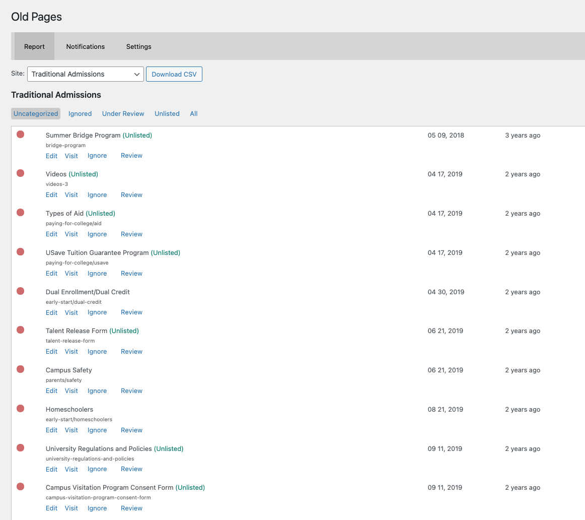
Old Pages plugin built by Joel Kuhn, Web Developer at Indiana Tech.
Learn more about how this data informed the designs.